World of Warcraft has a fairly powerful layout engine for creating user interfaces. When combined with lua for attaching behaviours to UI elements, this creates a flexible system with which the game's entire UI is created, as well as any custom AddOns.
This page started as a braindump of various aspects of the XML engine and API; over time, it has become a more useful reference, though it is still far from complete. For more information on creating AddOns, see AddOns, Interface Customization, World of Warcraft API and especially the Widget API which describes the programming aspects of all XML objects.
Note that this assumes familiarity with XML; for a quick introduction, see this XML Introduction at xmlfiles.com. Also note that the XML declaration (<?xml version="1.0"?>) may be omitted from UI .xml files.
Also note that as of version 1.10, all types of frames can also be created from LUA with the new CreateFrame() API.
The Basics
An XML file is a collection of elements (with a start and end tag), of which the User Interface files are no exception. There are two main types of elements that appear in the UI XML files. The first type are those that declare user interface items (or widgets), such as Buttons, Frames, Checkboxes. We will call these widget elements. The second type of elements, which always occur inside the first type, define properties and behaviour of the widgets. We will call these property elements. Here is an example:
<Button name="MyAddon_Button">
  <Anchors>
    <Anchor point="CENTER"/>
  </Anchors>
</Button>
The Button element is of the first type, in other words a widget element. Its appearance in the XML file causes a Button with the name MyAddon_Button to be created. The elements inside it (such as Anchors, Anchor) define its properties, hence are of the second type. The general structure is always the same, you have elements representing widgets, and other elements inside them representing their properties. It can also happen that a widget element is inside another one. For example:
<Frame name="MyAddon_Frame">
  <Anchors>
    <Anchor point="CENTER"/>
  </Anchors>
  <Frames>
    <Button name="MyAddon_Button">
      <Anchors>
        <Anchor point="CENTER"/>
      </Anchors>
    </Button>
  </Frames>
</Frame>
This example has two widget elements (Frame and Button), and several property elements (Anchors, Anchor). This creates a Frame, with a Button inside it. Here, MyAddon_Button is a child of MyAddon_Frame, and MyAddon_Frame is a parent of MyAddon_Button. Also note how the XML convention of abbreviating an empty element such as <Anchor point="CENTER"></Anchor> as <Anchor point="CENTER"/> is used.
Many of the elements (widget and property alike) can have attributes, such as the name attribute in the above examples.
A complete and valid XML file must contain exactly one element named UI, with some rather long attributes (best use copy/paste for this). Hence a minimal example of a complete UI XML file would be something like:
<Ui xmlns="http://www.blizzard.com/wow/ui/"
 xmlns:xsi="http://www.w3.org/2001/XMLSchema-instance"
 xsi:schemaLocation="http://www.blizzard.com/wow/ui/ ..\FrameXML\UI.xsd">
   <Frame name="MyAddon_Frame">
   </Frame>
</Ui>
Such a file will create a single Frame, named MyAddon_Frame. However, that Frame wouldn't be visible and wouldn't have any content.
Validation with XSD
If you use the Blizzard Interface Customization tool to extract the contents of the Interface\FrameXML folder, you will come across the file UI.xsd which provides a schema definition for automated validation of your customized XML-files. Notice that XSD is an advanced XML feature and requires a special editor as well as a good knowledge of advanced XML-concepts. If you've already worked with XML you might find this very helpful to get started with WoW.
Naming Widgets
Every widget element may have the name attribute. If an element has a name, it causes a global Lua variable to be created with that name. This variable can then be used to call API methods on that widget. (See Widget API for a list of methods available for the different UI widgets.) Note that global variables are truly global across the entire UI, meaning that every name must be unique across all XML files.
Here is an example. Let's say in your XML file you have a section like this:
<Frame name="MyAddon_Frame">
 ..
 <Frames>
  <Button name="MyAddon_Button">
   ..
  </Button>
 </Frames>
</Frame>
In any Lua code then you can use the variable MyAddon_Frame to refer to the frame and MyAddon_Button to refer to the button. For example, to show the frame, call MyAddon_Frame:Show(). Or to disable the button, call MyAddon_Button:Disable().
When defining the name of a widget, the special string $parent may be used. This will take on the name of whatever the parent of that widget is. For example:
<Frame name="MyAddon_Frame">
 ..
 <Frames>
  <Button name="$parent_Button">
  ..
  </Button>
 </Frames>
</Frame>
This results in two global Lua variables: MyAddon_Frame and MyAddon_Frame_Button.
Managing Frames
Note: A lot of this section applies to all user interface widgets, not just Frames. Properties for layout, sizing and so on are common to all widgets.
Layout
Frames have a combination of a size and one or more anchors. For a frame to be laid out, the combination of these needs to define a rectangle on the screen in which the frame is to be laid out.
A size is specified using a Size element with either an AbsDimension or RelDimension child element.
Anchors allow for relative positioning, and also to allow frames to dynamically reposition their content based on resizing. A group of anchors is expressed via an Anchors element with one or more Anchor children, each of which may have an Offset.
Some examples: TODO: Get screenshots of all of these
<Frame>
 <Size><AbsDimension x="100" y="100"/></Size>
 <Anchors>
  <Anchor point="TOPLEFT"/>
 </Anchors>
</Frame>
This specifies a 100x100 frame anchored so that its top left is at the top left of its parent frame.
<Frame>
 <Size><RelDimension x="0.5" y="0.5"/> </Size>
 <Anchors>
  <Anchor point="LEFT"/>
 </Anchors>
</Frame>
This specifies a frame that covers a quarter of your UI (regardless to the selected resolution).
<Frame>
 <Size><AbsDimension x="100" y="100"/></Size>
 <Anchors>
  <Anchor point="TOPLEFT" relativePoint="TOPRIGHT"/>
 </Anchors>
</Frame>
This specifies a 100x100 frame anchored so that its top left is at the top right of its parent frame.
<Frame>
 <Size><AbsDimension x="100" y="100"/></Size>
 <Anchors>
  <Anchor point="TOPLEFT" relativeTo="SomeOtherFrame">
   <Offset><AbsDimension x="10" y="-10"/></Offset>
  </Anchor>
 </Anchors>
</Frame>
This specifies a 100x100 frame anchored at the top left of the frame SomeOtherFrame, and offset by 10 pixels to the right and 10 pixels down. (Note that the Y axis increases from the bottom up, so negative Y coordinates indicate downwards movement).
<Frame>
 <Anchors>
  <Anchor point="TOPLEFT" relativeTo="SomeOtherFrame">
   <Offset><AbsDimension x="5" y="-5"/></Offset>
  </Anchor>
  <Anchor point="BOTTOMRIGHT" relativeTo="SomeOtherFrame">
   <Offset><AbsDimension x="-5" y="5"/></Offset>
  </Anchor>
 </Anchors>
</Frame>
Note that no Size is specified here; the size and location of this frame is defined entirely by its relationship to SomeOtherFrame. In particular, it will be inset by 5 pixels from the top left and bottom right of SomeOtherFrame. As SomeOtherFrame changes size, our frame will change size as well.
Showing/Hiding
Frames may be shown or hidden by FrameName:Hide() and FrameName:Show(). Also available are ShowUIPanel(FrameName) and HideUIPanel(FrameName).
Layers and Textures
There are 3 levels of layers: BACKGROUND is in the back, ARTWORK is in the middle and OVERLAY is in front. If you want to be sure that a object is before another, you must specify the level where you want to place it.
BACKGROUND - Level 0. Place the background of your frame here.
BORDER - Level 1. Place the artwork of your frame here .
ARTWORK - Level 2. Place the artwork of your frame here.
OVERLAY - Level 3. Place your text, objects, and buttons in this level
HIGHLIGHT - Level 4. Place your text, objects, and buttons in this level
- Elements in the HIGHLIGHT Layer are automatically shown or hidden when the mouse enters or leaves!
- For Highlighting to work you need enableMouse="true" in your <Frame> attributes.
Note: The above are capitalized for a reason. See example:
<Layers>
  <Layer level="BACKGROUND">
    ...
  </Layer>
  <Layer level="ARTWORK">
    ...
  </Layer>
  <Layer level="OVERLAY">
    ...
  </Layer>
</Layers>
Using Templates
Templates are used when you want to create a common layout for several frames. In this way you can save on the amount of code needed to recreate each frame, as the frames will automatically take on the properties, children, and attributes from whatever template it inherits. There are several rules that must be following when initially creating the template:
- Templates are created at the root of the file. Meaning that you cannot have a template that is a child of another element
- Templates must have their virtual attributes set to true
- Templates must have a name, and it cannot use the $parent keyword
- Children of a template do not need to be named, but when doing so, you should use the $parent keyword
As discussed above, there is a special keyword that can be used when naming something inside the template. When you inherit a frame, any object inside the template that is inherited, which has the keyword $parent, will automatically replace the keyword with the name of the parent which inherited the template. Example:
<Button name="MyAddonButtonTemplate" parent="UIParent" virtual="true">
     <ButtonText name="$parentText"/>
</Button>
<Button name="MyAddonSpecialButton" inherits="MyAddonButtonTemplate">
     <Size><AbsDimension x="40" y="22"/></Size>
</Button>
Is the same as doing:
<Button name="MyAddonSpecialButton" parent="UIParent">
     <Size><AbsDimension x="40" y="22"/></Size>
     <ButtonText name="MyAddonSpecialButtonText"/>
</Button>
Be aware that any inherited attributes, properties, or children can also be overridden. Example:
<Button name="MyAddonButtonTemplate" parent="UIParent" movable="true" virtual="true">
     <ButtonText name="$parentText"/>
</Button>
<Button name="MyAddonSpecialButton" inherits="MyAddonButtonTemplate" movable="false">
     <Size><AbsDimension x="40" y="22"/></Size>
</Button>
Is the same as doing:
<Button name="MyAddonSpecialButton" parent="UIParent" movable="false">
     <Size><AbsDimension x="40" y="22"/></Size>
     <ButtonText name="MyAddonSpecialButtonText"/>
</Button>
Templates can inherit other templates as well. When done in this way, any $parent keywords used in the template being inherited carry over to the template that inherits it. Example:
<Button name="MyAddonButtonTemplate1" parent="UIParent" movable="true" virtual="true">
     <ButtonText name="$parentText"/>
</Button>
<Button name="MyAddonButtonTemplate2" clampedToScreen="true" inherits="MyAddonButtonTemplate1" virtual="true">
     <NormalFont inherits="GameFontNormal"/>
</Button>
<Button name="MyAddonSpecialButton" inherits="MyAddonButtonTemplate2">
     <Size><AbsDimension x="40" y="22"/></Size>
</Button>
Is the same as doing:
<Button name="MyAddonSpecialButton" parent="UIParent" clampedToScreen="true" movable="true">
     <Size><AbsDimension x="40" y="22"/></Size>
     <ButtonText name="MyAddonSpecialButtonText"/>
     <NormalFont inherits="GameFontNormal"/>
     <HighlightFont inherits="GameFontHighlight"/>
</Button>
Scripts
To attach behaviour to the UI elements defined in the XML files, you must use Lua. There are two methods of attaching Lua code to UI elements.
- Short codes can go directly in the XML files in the appropriate event handler element (see later).
- Long codes should go in a separate .lua file, and included via a Script element.
To include Lua code via a Script element, you must have one or more <Script> elements at the start of the XML file. For example:
<Ui ... >
 <Script file="mycode.lua"/>
 <Frame name="MyFrame">
  ...
 </Frame>
</Ui>
When the XML file is read, the contents of the mycode.lua file is read and interpreted. The code in that file is then available for the rest of this XML file, and any XML files that are read after this one. Functions that are defined in mycode.lua can be called from event handlers in the XML file.
Basic Event Handling concepts
If you are not used to event handled programming, read this section, otherwise you can skip right through it.
Traditional programming style involves writing a program that has a start and finish. Execution starts at the beginning, and after following through the algorithm in the program, it eventually gets to the end.
Event handled programming is somewhat different. In this case, you create several, independent sections of code, with no clear start or finish. Each of these sections of code are designed to be executed in response to a certain event occuring. Such a section of code is called an event handler. An event handler may get executed once, many times, or maybe even never. This kind of programming style is used whenever you want your code to interact with an external program, and do things in response to whatever that program is doing.
In the case of World of Warcraft, the core game is external to the interface code. Whenever something happens in the game, it asks the interface code to respond to it, by calling one of the event handlers.
Handling UI Events
To handle UI events, you must include event handler elements in your XML code. You do this by having a Scripts element, inside of which you have one or more Onxxxx event handler elements. For example:
<Frame name="MyFrame">
 <Scripts>
  <OnShow>
   message("Hello!");
  </OnShow>
 </Scripts>
</Frame>
This frame has one event handler only, which is executed every time this Frame becomes visible. The contents of the OnShow element can be any valid Lua code. In this example, it's a single statement, which calls the function message, which causes a dialog box to pop up with "Hello" inside it. (message is a function defined in BasicControls.xml and is available by default.)
Here is a more complete example of how you include Lua code and then reference it from the event handlers.
mymod.xml:
<Ui ... >
  <Script file="mymod.lua"/>
  <Frame name="MyModMainFrame">
    <Scripts>
      <OnLoad>
        MyMod_ShowMessage();
      </OnLoad>
    </Scripts>
  </Frame>
</Ui>
mymod.lua:
function MyMod_ShowMessage()
  message("Hello World!");
end
When MyModMainFrame gets loaded (which happens once, at the start of the game, when all the XML files are read in), the OnLoad handler gets executed. In this case, the single Lua statement there simply calls the MyMod_ShowMessage function.
It is recommended that you prefix the names of all of your functions, UI objects and global variables with the name of your AddOn like above; all data is shared between Blizzard's own UI and all your addons, so picking a unique prefix helps avoid clashes with other people's code.
For the above example to actually work, you must either create an AddOn with the mymod.lua and mymod.xml files, or include them in the FrameXML directory and reference myframe.xml from FrameXML.toc. See AddOns on how to combine these files into an AddOn.
Event Handler reference
Widget Handlers is a complete reference of what event handlers can be used by each object type.
- Note: the OnEvent handler is special (see below).
You will notice that the event handlers in the list mostly cover UI related events. The OnEvent handler is special in that it is a general, collective handler for a large number of other events. It gets called for any of the remaining hundreds of game related events. See Events for a list of game events and how to register for them and handle them.
Widget Elements
Most of the information here is extracted from UI.xsd. It is by no means complete, and can change any time.
Widget elements have a hierarchical relationship between them. Some widget elements are derived from others, which means that they inherit the kind of attributes and property elements that are allowed for them. This inheritance also applies to the API functions available for that type of widget.
Note: This hierarchy is not to be confused with the parent-child relationship of the concrete widgets created in the XML files. It also shouldn't be confused with inheriting templates (or virtual elements).
This list shows the inheritance relationship of the widget elements:
In the XML files, wherever a widget element is expected, you may instead use a widget that is derived from that one. In the reference below, curly braces {} are used to indicate when such substitution is possible.
UI
Elements: Include, Script, {LayoutFrame}
LayoutFrame
Elements: Size, Anchors
Attributes: name, inherits, virtual, setAllPoints, hidden
Texture
Derived from: LayoutFrame
Elements: TexCoords, Color, Gradient
Attributes: file, alphaMode
Note: The Texture must be within a <Layer>
FontString
Derived from: LayoutFrame
Elements: FontHeight, Color, Shadow
Attributes: font, bytes, text, spacing, outline, monochrome, nonspacewrap, justifyV, justifyH, maxLines, inherits
The Fontstring element is used to display a text in the user interface. The text displayed by the Fontstring element can be changed with the LUA function <fontstringobject>:SetText() or read with the the function <fontstringobject>:GetText().
outline = "NORMAL" or "THICK", monochrome = "true" or "false", justifyV = "TOP", "MIDDLE" or "BOTTOM", justifyH = "LEFT", "RIGHT", "CENTER"
<Shadow><offset><AbsDimension x="1" y="1"/></offset><color r="0" g="0" b="0"/></Shadow>
inherits can be set to an existing font. If set, the current FontString will take on all of that font's settings, unless overridden in the current FontString.
Note: <FontString> must be within a <Layer>
 See FrameXML/Fonts.xml for the system default list of inheritable fonts!
Frame
Derived from: LayoutFrame
Elements: TitleRegion, ResizeBounds, BackDrop, HitRectInsets, Layers, Frames, Scripts, BackgroundInsets
Attributes: alpha, parent, toplevel, movable, resizable, frameStrata, frameLevel, id, enableMouse, enableKeyboard
Button
Derived from: Frame
Elements: NormalTexture, PushedTexture, DisabledTexture, HighlightTexture, NormalText, HighlightText, DisabledText, PushedTextOffset
Attributes: text
Notes: The various textures, once inherited or set to art of your choice, will automatically behave as expect. (highlight on mouseover, pushed while clicked, disabled when disabled) The same goes for the different texts.
Example
Included in Backdrop
<Button name="$parentButtonClose" inherits="OptionsButtonTemplate" text="Close">
	<Anchors>
		<Anchor point="BOTTOMRIGHT">
			<Offset>
				<AbsDimension x="-12" y="16"/>
			</Offset>
		</Anchor>
	</Anchors>
	<Scripts>
		<OnClick> autoInviteMainConfigFrame:Hide(); </OnClick>
	</Scripts>
</Button>
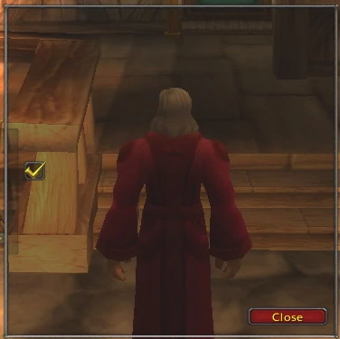
CheckButton
Derived from: Button
Elements: CheckedTexture, DisabledCheckedTexture
Attributes: checked
Note: For checkbuttons, setting the label of the checkbutton works differently from normal buttons. Using MyCheckButton:SetText("monkey"); will not give you a visible result. Instead, you need to address the text property of the checkbuttons invisible FontString frame. The FontString frame is named "<checkButtonName>Text", so to address it, use the following lua code: getglobal(MyCheckButton:GetName() .. "Text"):SetText("Monkey");
Example
Included in Backdrop
<CheckButton name="$parentCheckButton" inherits="OptionsCheckButtonTemplate" checked="true">
	<Anchors>
		<Anchor point="LEFT">
			<Offset>
				<AbsDimension x="20" y="0"></AbsDimension>
			</Offset>
		</Anchor>
	</Anchors>
</CheckButton>
StatusBar
Derived from: Frame
Elements: BarTexture, BarColor
Attributes: drawLayer, minValue, maxValue, defaultValue
Slider
Derived from: Frame
Elements: ThumbTexture
Attributes: drawLayer, minValue, maxValue, defaultValue, valueStep, orientation
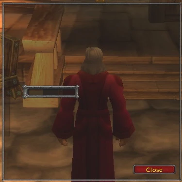
EditBox
Derived from: Frame
Elements: FontString, HighlightColor, TextInsets
Attributes: letters, blinkSpeed, numeric, password, multiLine, historyLines, autoFocus, ignoreArrows
Example
Included in Backdrop
<EditBox name="$parentEditBox" letters="80">
	<Size>
		<AbsDimension x="100" y="32"></AbsDimension>
	</Size>
	<Anchors>
		<Anchor point="LEFT">
			<Offset>
				<AbsDimension x="50" y="0"></AbsDimension>
			</Offset>
		</Anchor>
	</Anchors>
	<Layers>
		<Layer level="BACKGROUND">
			<Texture file="Interface\ChatFrame\UI-ChatInputBorder-Left">
				<Size>
					<AbsDimension x="75" y="32"></AbsDimension>
				</Size>
				<Anchors>
					<Anchor point="LEFT">
						<Offset>
							<AbsDimension x="-10" y="0"></AbsDimension>
						</Offset>
					</Anchor>
				</Anchors>
				<TexCoords left="0" right="0.2" top="0" bottom="1.0"></TexCoords>
			</Texture>
			<Texture file="Interface\ChatFrame\UI-ChatInputBorder-Right">
				<Size>
					<AbsDimension x="75" y="32"></AbsDimension>
				</Size>
				<Anchors>
					<Anchor point="RIGHT">
						<Offset>
							<AbsDimension x="10" y="0"></AbsDimension>
						</Offset>
					</Anchor>
				</Anchors>
				<TexCoords left="0.7" right="1.0" top="0" bottom="1.0"></TexCoords>
			</Texture>
		</Layer>
	</Layers>
	<Scripts>
		<OnLoad></OnLoad>
	</Scripts>
	<FontString inherits="ChatFontNormal"></FontString>
</EditBox>
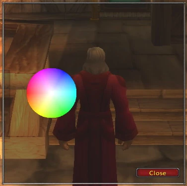
ColorSelect
Derived from: Frame
Elements: ColorWheelTexture, ColorWheelThumbTexture, ColorValueTexture, ColorValueThumbTexture
Example
Included in Backdrop
<ColorSelect name="$parentColorSelect" enableMouse="true">
	<Size>
		<AbsDimension x="100" y="100"></AbsDimension>
	</Size>
	<Anchors>
		<Anchor point="LEFT">
				<Offset>
					<AbsDimension x="50" y="0"></AbsDimension>
				</Offset>
		</Anchor>
	</Anchors>
	<ColorWheelTexture></ColorWheelTexture>
</ColorSelect>
Model
Derived from: Frame
Elements: FogColor
Attributes: file, scale, fogNear, fogFar
SimpleHTML
Derived from: Frame
Elements: FontString, FontStringHeader1, FontStringHeader2, FontStringHeader3
Attributes: files
MessageFrame
Derived from: Frame
Elements: FontString, TextInsets
Attributes: fadeDuration, insertMode
ScrollingMessageFrame
Derived from: Frame
Elements: FontString, TextInsets
Attributes: fade, fadeDuration, displayDuration, maxLines
ScrollFrame
Derived from: Frame
Elements: ScrollChild
MovieFrame
Derived from: Frame
GameTooltip
For a Lua pseudo code representation of the tooltip widget's methods, see Tooltip Pseudo Code
Derived from: Frame
Elements: ?
Attributes: ?
TaxiRouteFrame
Derived from: Frame
Elements: ?
Attributes: ?
LootButton
Derived from: Button
Elements: ?
Attributes: ?
TabardModel
Derived from: PlayerModel
Elements: ?
Attributes: ?
PlayerModel
Derived from: Model
Elements: ?
Attributes: ?
Minimap
Derived from: Frame
Elements: ?
Attributes: ?
WorldFrame
Derived from: Frame
Elements: ?
Attributes: ?
Default User Interface
The default user interface that is visible without any installed third-party addons is built into the MPQ files. It can't be modified because it is protected by a digital signature, but using the User Interface Customization tool provided by Blizzard, the files can be extracted to see how the interface works.
Widget Reference
I have not yet finished and probably will never since not all properties of elements used in default interface and addons not guarantee because patch changes rules from time to time. Still here is the reference for everything used in standart interface, with a new view on some of details of understanding schemes.